Whoopeeeeee!!!! The applique is all glued and ready for sewing. I have made a mock quilt in EQ7 and this is what I came up with. Hope you like it. I do have to say that the pictures came out a little on the green side. the background isn't light aqua it's light blue. I have created a supply list in PDF form, just click on the above picture and you will be transported to the download page.
Block 1 is Snowy Stocking, just click the picture below for transportation.
The only special instructions are about shading and shadowing. To shade or not to shade that is the question. While working on this quilt I was very disappointed that the white cat didn't pop like the black cat in Spooky Hallows. I did what most of us do I whined to my friends. My BFF in Vancouver, Wa told me to shade one side with what ever color I choose and it should pop. Well, I shaded it in medium blue because the background is light blue. Wrong, wrong, wrong. Then I spoke to my BFF in Texas, who taught a color class for quilters for years. She told me that BFF Vancouver was right but that I should use 1 color down on the color wheel 1-2 shades darker than the background.
If this sounds like Greek to you don't feel bad. I've been quilting for over 30 years and have taken several color classes in quilting and water color and have never heard this. Well I made her explain it better and told her she needed to write lessons on color on her blog which she promised me she would do. I will nag regularly until she does it. So let me introduce you to BFF Texas: Alexandra Henry,
http://blog.artbyalexa.com/ , she is currently a freelance graphic artist working with Pellon. She has many free designs on the Pellon website
http://www.pellonprojects.com/. She is a master embroiderer and has been designing quilts for many years. Check out her blog she has several very interesting lessons on applique and embroidery.
So back to shading and shadowing. First shading is a line of color behind the subject to make colors show better. Shadowing is just like our real life shadows and is much larger that shading. Here is what she told me:
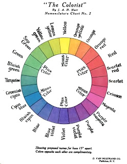
Shading and highlighting color: Shading or shadows should be 1 color down on the colorwheel ie: blue background should be shadowed in blue violet 1 or 2 shades darker then the blue.
Highlights should be a color up on the colorwheel. ie: blue should be highlighted with green. Highlights colors are chosen from the subject not the background. Use 24 color colorwheel I am attaching a copy of an old 24 color colorwheel
This color wheel is from 1908 and some of the color names are different but most aren't. Alexandra told me she has her own that she will share with us when she starts writing the lessons.
I have included the shading templates in the design but they won't be necessary unless you have trouble with the cat as I did. If I had used a darker color for the background it wouldn't have needed shading. But if I had used a darker background then the other colors would have been wrong. White is just a hard color to work with unless you are using a very dark background.
Noel is Here!!!
Marjory


